The most interesting topic: Cognition and Memory
Designing an interface for users based on how human brains work can improve the effectiveness of it.
Before this topic was introduced, I have some understanding of cognitive science, but never connect cognition and interface design together. It is interesting and useful to know how to design interfaces in a more effective way using knowledge of cognition and memory.
The most boring concept: Data Gathering
This topic is the instructions of how to correctly do data gathering. It is usually some details that experimenter needs to be careful not to misleading the subjects. Although acknowledging that this topic is useful in doing research, this topic only contains instructions (what to do and what not to do) and this causes this topic to be boring. Maybe adding some interesting examples, such as an experimenter was not careful and misled his subjects and caused a hilarious experiment result.
My experience of putting a concept I learned in the course into practice:
I used the concept I learned in my csc301 project, which is a project building a web. When designing the web interface, I carefully consider the colour and layout I used, so that the colours on the page match with each other and the whole page looks pleasant. And users should not be confused of how to operate.
Alternative take on the concept of data gathering:
Give out sentences in different wording. Students in class can test using those sentences with each other and feel the power of wording themselves.
Topic that I wish we had covered in more detail: Cognition and Memory
Some people might think that the arts and style are the only thing to be considered for design. However, cognition and memory in design are as important as arts and style. In fact, arts and style are parts of cognition - what will pleased users the most (what colour, font and so on). But I do realize that this is not a cognitive science course, putting too much time on this topic may not be reasonable.
CSC318 is really an amazing course. Allow me to say great thanks to the instructor, all the TAs and classmates in this course for giving me such a great experience.
Sunday, April 2, 2017
Sunday, March 19, 2017
Email Notification in Piazza
 The email notification feature in Piazza is automatically turned on when account is created and user will receive an email every time a question is posted in the question board. In most of the time, this causes users to have over 20 emails a day. Most of them don't need this feature and they have to change the email setting. Many users complain about email notification because they have a hard time finding where to turn the notification off. There is no option for users to unsubscribe in the email received. The only way to unsubscribe theses notifications is to log in piazza, click on the small button on the top right corner and choose account/email setting, and the page below will be shown. Users can turn off notification in the below page.

Although the complaints never stop for the three years I have been using Piazza, no changes is made on this email notification feature. It is like a barrier or challenge for every new user to overcome. This problem can be easily solved if one of the people maintaining Piazza system has read the feedback given by users and make some changes with it (ex. decides not to notify users with email if users do not specify).
Saturday, March 4, 2017
Android Interface and ios Interface
There are difference between Android interface and ios interface.

Android interface
Start page on the left and Application page on the right
Android interface's idea is similar to the one of computer interface. Android has the icons of application placed on the desktop/start page, and applications are stored in a different page. User can place or delete icons in start page but operations on applications can only be done in the application page.
 ios interface
In ios interface, application icons showing in start page are not just icons. Operation on applications (delete, change position, etc) can be done in start page and application page does not exist.
Many users choose ios's interface over Android's because when being introduced to two interfaces at the same time, they find it easier to understand ios interface with one page than Android interface with two pages. At the same time, they find the start page and the application page are too similar, and the application page is duplicated.
Although it seems the designer of Android interface tries to introduce interface through guiding users to associate phone interface to computer interface, it does not work as successful as ios interface's idea which is simply based upon direct manipulation. Since at all time, a concise interface is what users want to see.
Citation:
http://www.greenbot.com/article/2061282/android-4-4-kitkat-review-an-only-slightly-better-android.html
https://developer.apple.com/ios/human-interface-guidelines/visual-design/animation/
Sunday, February 19, 2017
Read Receipts in Instant Messenger
There are some instant messenger applications have read receipts. However, lots of users complain about this feature because this is causing so many concerns and troubles in their user experience.
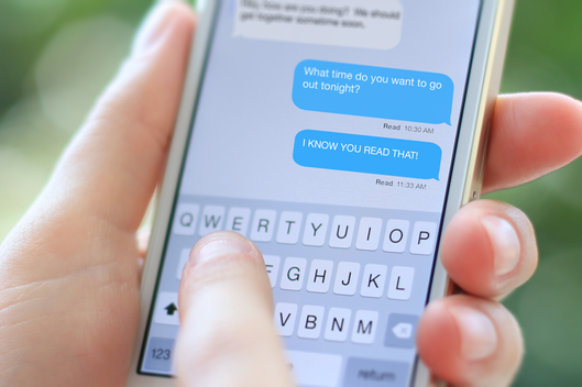
The read receipts feature shows the time of the user reading messages to the people who chat with the user. As a user of the Facebook messenger app, I think the time of reading messages is something private and I am not willing to be known by other people. And the worst thing is, in Facebook's messenger app, this feature cannot be turned off.
This feature makes chatting online more similar to chatting in reality but it is a worse experience online than in reality. It is more similar because in conversation in reality, people acknowledge when other people receive their information. However, with this feature, knowing the time the receiver read the message is the only thing they have and things such as receiver's facial expression and reaction are missing, which could cause a huge misunderstanding between sender and receiver.
For a designer of an application, it is important to do research on what users really need before building anything. The designers of the read receipts in instant messenger obviously didn't do research on users' needs because there are lots of complaints from users, and even questions such as "Why? Why on earth would you voluntarily use Apple's read receipts?". Designers built this feature just because they want to. At the same time, when there is a new feature, leave the users a choice of not using the feature to test how users feel about it and it can also prevent users eventually choosing other apps over this one only because they do not like the new feature.
Citation:
http://nymag.com/thecut/2014/08/turn-off-your-read-receipts-now-a-plea.html?mid=twitter_nymag

"read" is shown with the time of the receiver reading the message
The read receipts feature shows the time of the user reading messages to the people who chat with the user. As a user of the Facebook messenger app, I think the time of reading messages is something private and I am not willing to be known by other people. And the worst thing is, in Facebook's messenger app, this feature cannot be turned off.
This feature makes chatting online more similar to chatting in reality but it is a worse experience online than in reality. It is more similar because in conversation in reality, people acknowledge when other people receive their information. However, with this feature, knowing the time the receiver read the message is the only thing they have and things such as receiver's facial expression and reaction are missing, which could cause a huge misunderstanding between sender and receiver.
For a designer of an application, it is important to do research on what users really need before building anything. The designers of the read receipts in instant messenger obviously didn't do research on users' needs because there are lots of complaints from users, and even questions such as "Why? Why on earth would you voluntarily use Apple's read receipts?". Designers built this feature just because they want to. At the same time, when there is a new feature, leave the users a choice of not using the feature to test how users feel about it and it can also prevent users eventually choosing other apps over this one only because they do not like the new feature.
Citation:
http://nymag.com/thecut/2014/08/turn-off-your-read-receipts-now-a-plea.html?mid=twitter_nymag
Sunday, February 5, 2017
Designing for General Population
Tow months ago, I purchased the game "tomb raider". I have never play the "tomb raider" series and hardly ever played any puzzle game. I put lots of expectation since it is quite famous and some comments online saying how great the graphic it has.

As I began, everything was good, until I got stuck in a level. In the game, there is always one hint for the next performance which is very helpful. However, some of the hints are too implicit and it is a goal rather than a hint that tells what the next action should be. I spent about 20 minutes on it and still couldn't figure out what to do and there is no option to skip the level, so I gave up.
This game only has one storyline and players have to follow what it tells them to do. Compare this game to Grand Theft Auto 5 which has one major storyline and some minor ones. In GTA's main storyline, if a player fails a level for couple times, there is an option that the play may skip this level. I really like this feature and I play most of the levels in GTA and still continuing. This option helps when I get frustrated for failing a one level couple times and it doesn't affect my understanding of the story since I have gone through most of it in the failures.

The designer of Tomb Raider may not consider enough for general population. The game experience for the game designer and players are different. The difficulty of a game to designer could be a lot less than players. Some players may enjoy solving the puzzle in this game, but I am not so into puzzle and more interested in adventure. Most importantly, the frustration of keeping failing a level in a game lowers the game experience a lot.
The designer of GTA did a much better job on designing a product for general population than the designer of Tomb Raider who creates a game for a more specific group. Designer of Tomb Raider could have been more considerate to general population rather than considering only for fans of the Tomb Raider series and puzzle games. Small things like "skip" option really affects user experience in a great extend.
Bibliography:
https://www.google.ca/url?sa=i&rct=j&q=&esrc=s&source=images&cd=&cad=rja&uact=8&ved=0ahUKEwj4nJTmovrRAhWJ5oMKHSgUCwIQjRwIBw&url=https%3A%2F%2Fwww.youtube.com%2Fwatch%3Fv%3DRt_wruj1PfA&psig=AFQjCNGntfQBjHl6Gw1V29vPMk2A6pAaMw&ust=1486428983468038
https://www.google.ca/url?sa=i&rct=j&q=&esrc=s&source=images&cd=&cad=rja&uact=8&ved=0ahUKEwj1jt7Bo_rRAhVJ5YMKHXBlA7wQjRwIBw&url=http%3A%2F%2Fgearnuke.com%2Frise-tomb-raider-xbox-one-vs-xbox-360-direct-feed-screenshots-comparison-worth-upgrade%2F&psig=AFQjCNH5snB31VlM_9aMf4YPt3vabZDhUg&ust=1486429494235676
Sunday, January 22, 2017
Solving Existing Problem verses Innovation (ios 10 Lock Screen)
previous ios lock screen
slide to unlock

ios10 lock screen
either use TouchID or press home button to unlock
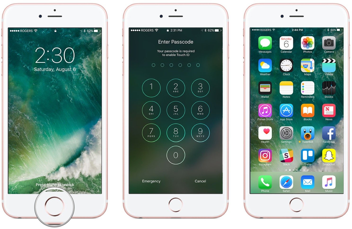
Apple changed its lock screen in ios 10. They introduced the new way of unlocking screen using TouchID which recognizes users' fingerprint or unlocking by pressing home button.
The old way "slide to unlock" is a brilliant design. User knows how to use the old way to unlock screen immediately after they read "slide to unlock". It doesn't require users to learn (Usability: efficient and learnable). Too bad that they abandoned the old way of unlocking screen.
The new way "press home button to unlock" sharply increases the chance of using home button. Lots of iphone users encounter the problem of broken home button. As an iphone user, I avoid unnecessary use of home button at all cost even though sometimes it takes me some more operations on touch screen. Also, the new update brought me confusion at first and I need to learn how to use the new unlock (Usability: not satisfying).
The fingerprint technique, TouchID is not mature enough. I fail to unlock using TouchID to unlock when there is sweat on my hand, which happens to me a lot (Usability: not effective and not satisfying).
I can see that Apple tries really hard to introduce TouchID unlock. My own guess for the reason they changed "slide to unlock" to "press home button to unlock" is because of TouchID. When using TouchID, users put one of their fingers on home button, and they want both operations on the same place, so they changed "slide to unlock", an operation done on touch screen to "press home button to unlock" an operation done on home button.
Based on UCD, designers should do research on users' needs and design solutions. Personally, my need on avoiding broken home button is much stronger than on TouchID and I prefer "slide to unlock". To me, TouchID for screen unlock is not something necessary. The update to ios10 did not solve my problem but increases struggle.
Designers should focus more on solving the existing problem instead of innovation.
Subscribe to:
Posts (Atom)